Codebase Rebrand
Graphic, Web Design
01 | background
The summer of 2018, I worked very closely with Cindy Yuan, the VP of Marketing
of UC Berkeley's software development club, CodeBase in an effort to completely
rebrand the club's image. Our goal was to provide the club with a more professional appearance to both potential new
members and clients for the upcoming year.
This page describes the progress of CodeBase's summer rebrand and documents the thought process behind each design decision.
This page describes the progress of CodeBase's summer rebrand and documents the thought process behind each design decision.
02 | identifying problems
The previous website had several issues that needed to be addressed, all of which stemming back to the fact that it failed
to achieve its primary goal: to inform two separate audiences about the purpose of Codebase, and how they can benefit
from working with them.
03 | creating goals
Codebase's two primary audiences needed to be addressed more precisely, and directly. These audiences are
1) aspiring software developers studying at UC Berkeley who would like to have more project-based experiences, and
2) Bay Area clients with projects in need of implementing.
Consequently, we created a goal for how exactly we would like Codebase to be perceived:
a student-based, on campus software-development organization that pairs teams of students with semester-long projects.
We also wanted students interested in applying to be informed of the two types of projects that the club offers each semester – mentored and client– as well as be able to identify which ones would best suit their current experience level and personal goals.
04 | ideation & prototyping
In order to accomplish the goals we defined, I attempted to implement several key changes that I believed would tackle the main issues with
the original website design.
Center-Focused Page Structure
Cindy and I decided that having a consistent, center-oriented structure throughout all of the pages on the site would be an easy way to establish a professional and clean tone to the site. It would also inhibit any attempts to include unnecessarily long blocks of texts, as centered text has a the best visual appearance when it is concise.
Complementing this new structure with the color-blocking of Codebase's navy theme color and white made for a nice contrast between the content aligned in the center and the white space on the margins.
Greater Focus on Visual Presentation
I am specifically defining this detail as a keener attentiveness towards both 1) incorporating visual graphics to break up long sections of text as and 2) using visual representations as a vehicle in itself for conveying information.
The use of graphic icons adhering to Codebase's theme colors and values made for a more visually appealing depiction of information, such as on the about page.
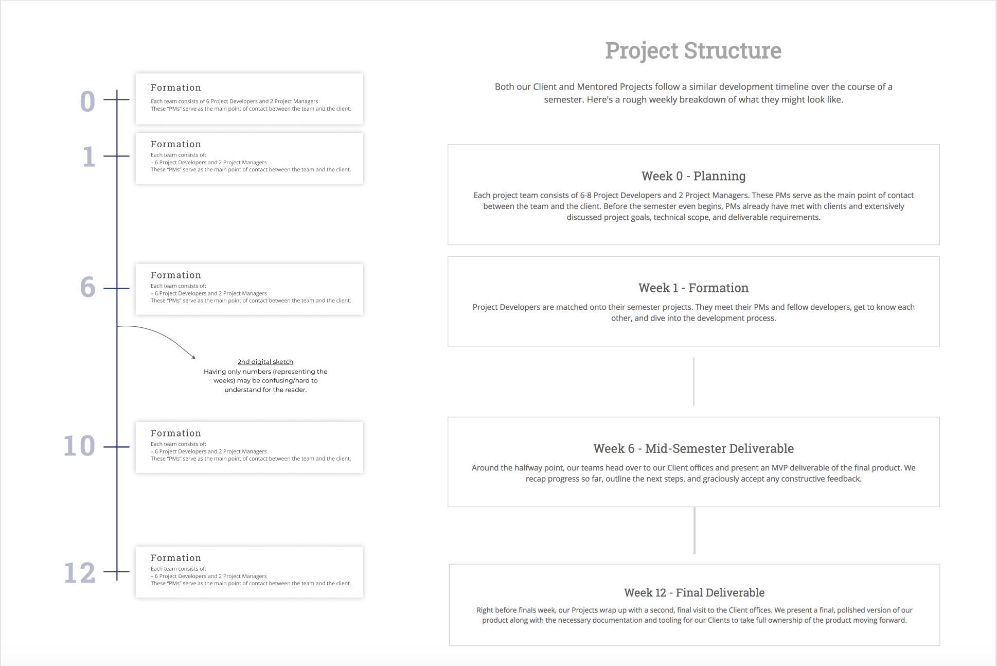
The use of a timeline graphic to pinpoint the key processes throughout the project development process replaced the previous,
lengthy paragraph description. The original design aimed to use the connection between the numbers on the line to portray which
weeks an event spanned, however this proved to be infeasible to actually implement on the website.
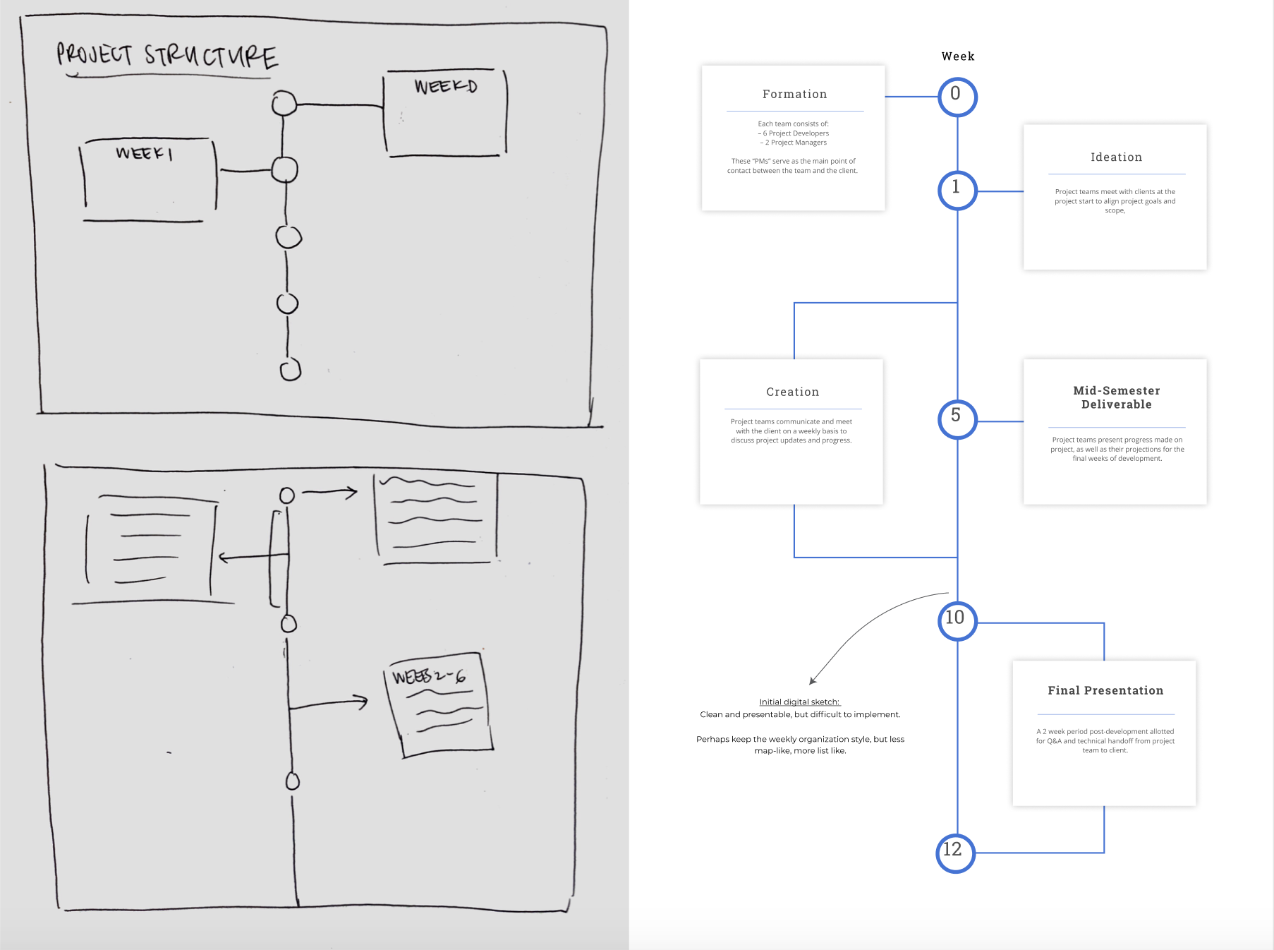
Instead, we adapted the timeline structure in conjunction with our center-aligned theme to preserve both readability,
visual appeal, and feasibility.
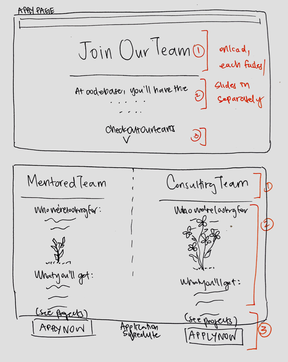
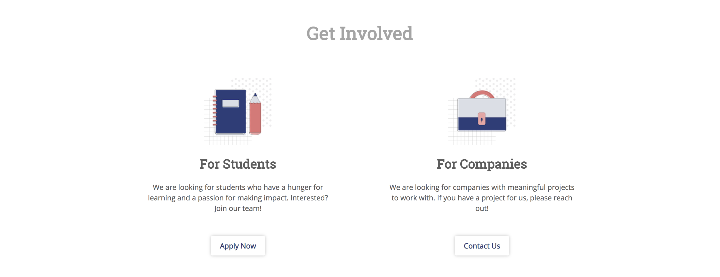
Dual Columns
We designed the application page in a way that prioritizes the reader's ability to distinguish between the two types of projects that our club offers each semester. Using parallel columns brought far more visual and informative clarity for the reader, and more effectively gets the point across than the previous explanation scurried away in the FAQ.
The information included in both columns were the same, explaining:
1) what types of students are fit for the role, and
2) what they would get out of the experience if they chose to join.
We also placed a button to apply right underneath each description so that the transition rate between being informed about our club and projects and actually applying was high.
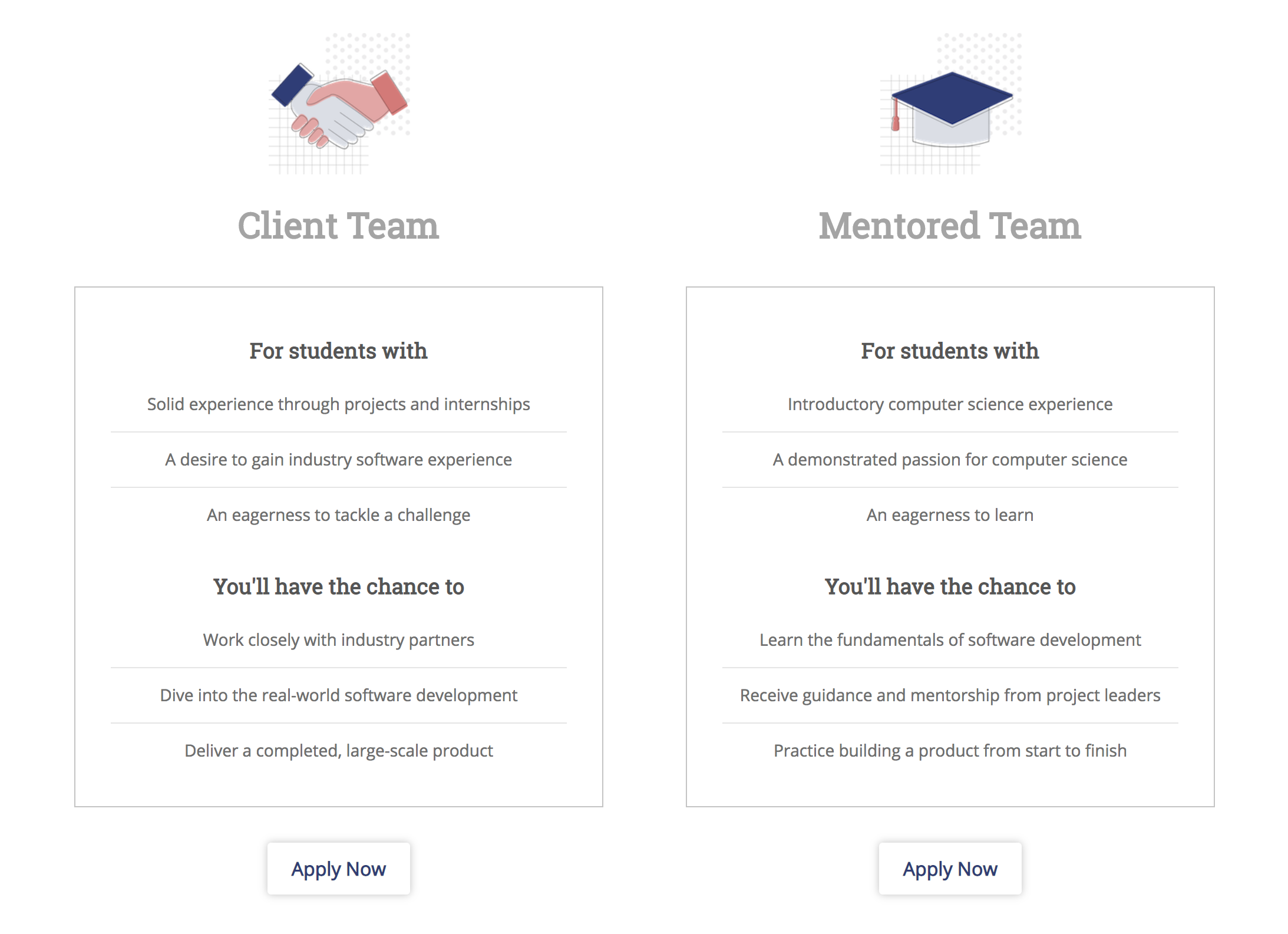
The dual column visual accompanied by the call-to-action button underneath extended to the distinction between our two main
audiences as well – students and companies.
05 | icon design
In addition to redesigning the layout and structure of the Codebase website, I also designed several graphic icons on Adobe Illustrator to use
to decorate key components of several pages on the site. I wanted these icons to fit in with the professional tone set up for the new site,
while at the same time providing a sense of individuality and brand.
I maintained a consistent, uniform background pattern for all of the designs, as well as incorporated shades of pink as an accent to the dark blue theme to introduce a more playful edge to the otherwise simplistic icons. I also used very thin, clean lines to both outline and overlap the main images to give the shapes a more coherent structure.
Much of the inspiration I got for these designs came from the icon design showcased on Slack's homepage.
06 | final product
Our new website is live at codebase.berkeley.edu!
07 | marketing
VP of Marketing –– updated: Spring 2019
The following semester, I ended up taking over the role of Codebase's VP of Marketing!
In addition to being responsible for managing the new website, I designed promotional recruitment material (physical & digital flyers), updated the club Facebook page, organized our semesterly photoshoot, and also founded the organization's first marketing team.